Alignment is one of the most important design principles.
I don't think any good design is possible without relying on Alignment. It serves to organize different elements in their composition, giving structure to the design, making it sharp, easy to read, and creating balance.
There are so many different ways to apply alignment in our designs.
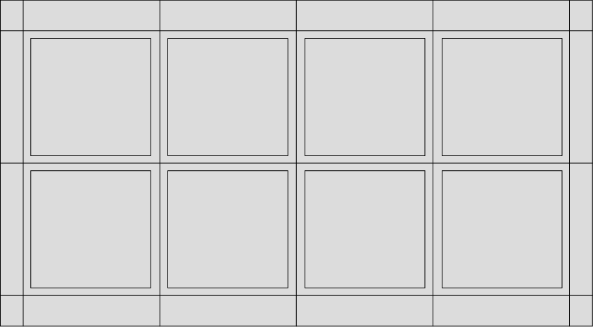
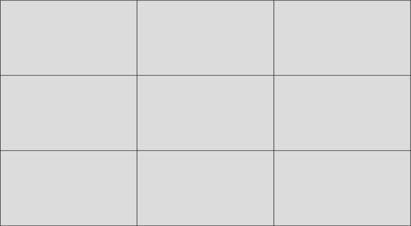
Using grids is a good practice for this.
While you probably won’t notice when the elements in a design are aligned, you will almost definitely notice when they aren’t. It's easy to see poor alignment when the design feels cluttered or not professional somehow. Unlike design using alignment, will look not only organize but will be much more effective in sending the message across to the viewer. Showing a clear visual hierarchy that makes the design easy to read.
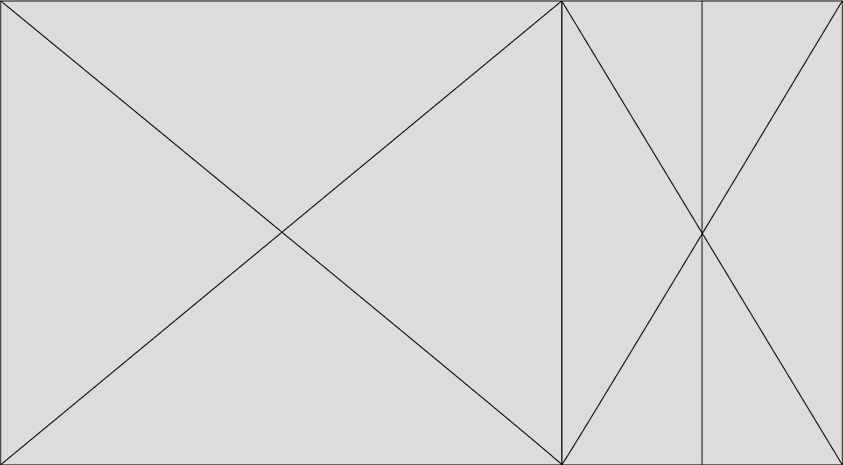
SOME MORE TIPS TO USE ALIGN PRINCIPLE IN YOUR COMPOSITIONS
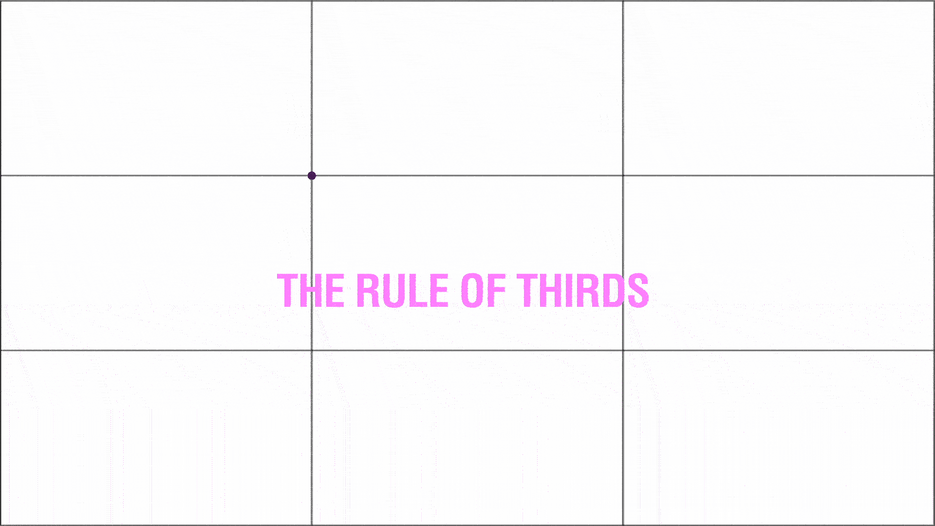
A FEW OF MY FAVORITES GRIDS