
Mrs Einsenstein says that a film should be made by
a succession of images juxtaposed so that the contrast between these images,
moves the story forward in the mind of the audience.
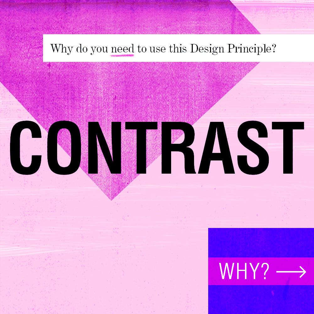
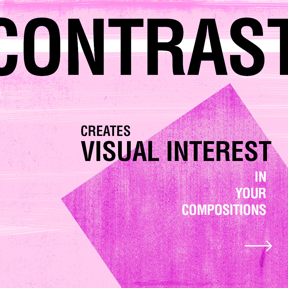
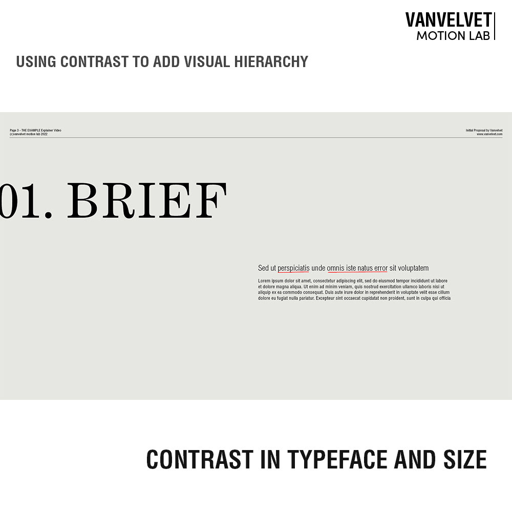
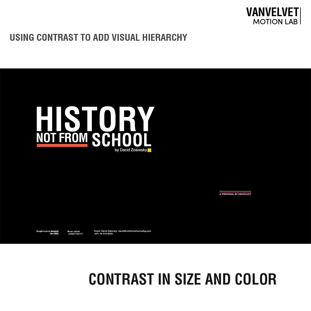
Contrast means a difference of some kind. Contrast allows for creating Visual Interest which sets up the basis to establish, anticipate or generate Drama and therefore, to engage with our Audience.
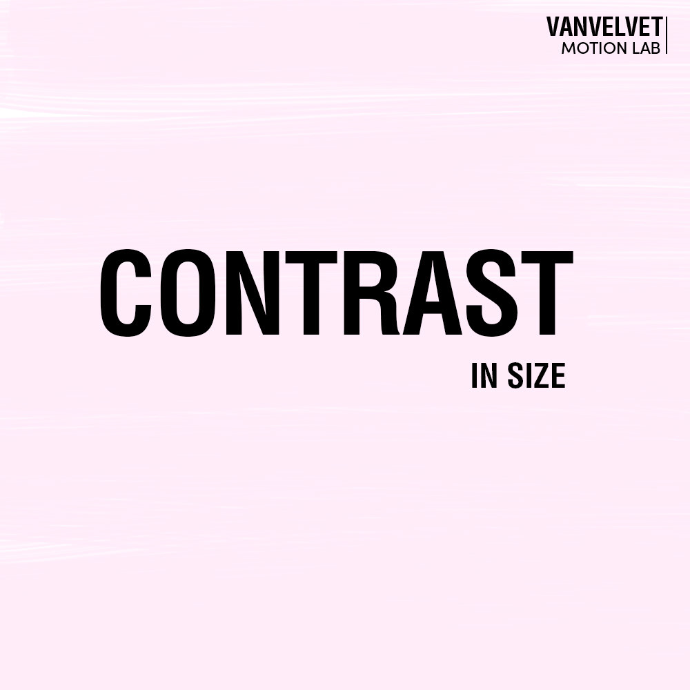
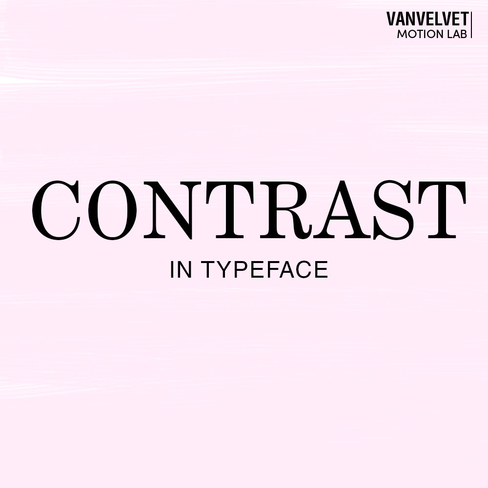
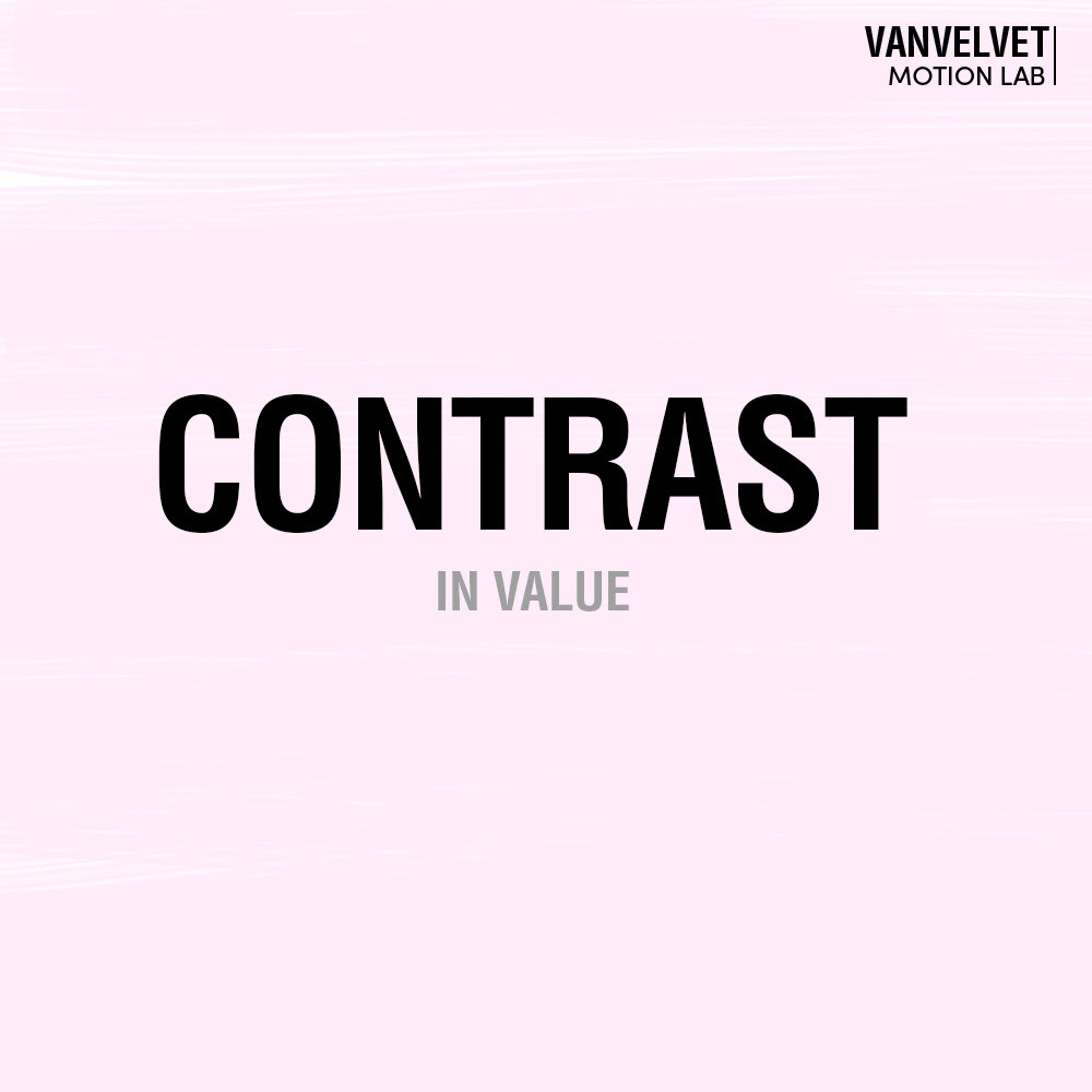
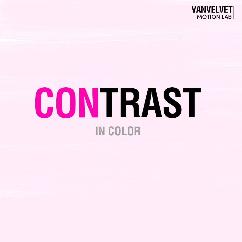
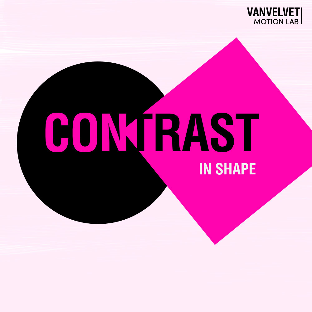
We can have Contrast in:
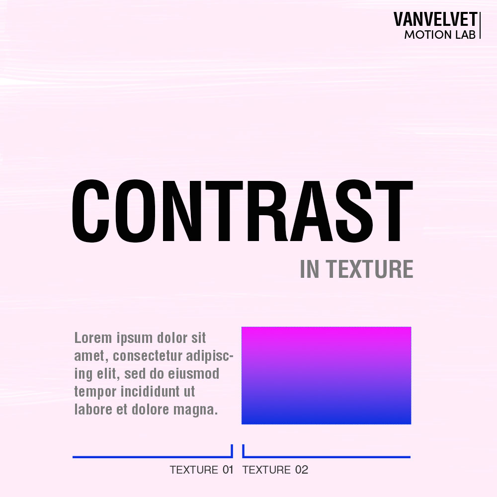
Color · Value · Form · Size · Texture · Typeface
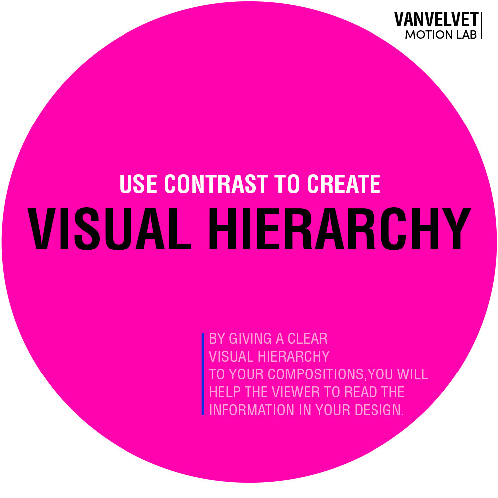
VISUAL HIERARCHY is a design principle you cannot miss when designing Presentations. It's about arranging the elements in an order that helps the viewer understand and read the design and, therefore, the message.
That's when Contrast comes in handy. By using 'contrast' you can establish the visual hierarchy in your design. Some elements will stand out, while others won't feel the main element to focus the attention on.
We want to lead the viewer's eyes throughout the composition. So let's think: What is the crucial information on this page, where do we want the viewer's eyes to go right after reading this element?
It's always a combination of using the Design principles.
Contrast will allow to set up a Visual hierarchy, Balance will help to lay out the composition in a way that everything on the page will be felt in Harmony.
If we think about the presentation as a little story we are telling our audience, Contrast helps to build up drama, leading us to produce Visual interest to engage with the audience. So, the design gives structure to the information contained in the presentation itself.